Usability Study
Pokémon Go- Heuristic Evaluation
Tools Used

Notion
UAR
Figma
Google docs


Application Description
Pokémon GO is an augmented reality (AR) mobile game developed by Niantic. Players can explore their surroundings to catch, train, and battle Pokémon. The app uses real-time location and navigation for players to move around. It also has “Pokestops” and “Gyms” which are landmarks or areas of interest where players can interact, like collecting missions, and items and participating in “raids” with other players.
Tasks a User Can Complete:
Catching Pokémon: Users can find and catch wild Pokémon by physically exploring their surroundings, aiming and throwing Poké Balls, and using items like Berries to improve capture chances.
Battling in Gyms: Players can engage in Gym Battles, either to defend a Gym controlled by their team or to challenge rival Gyms. Battles involve strategy, dodging, and the use of charged moves.
Participating in Raid Battles: Users can team up with other trainers to take on powerful Raid Bosses, coordinating their efforts to defeat the boss and earn rewards.
Completing Research Tasks: The app offers daily and special research tasks that users can complete for rewards, including encounters with unique Pokémon.
Customizing Trainer Avatar: Players can personalise their Trainer avatar's appearance by choosing from various clothing items, hats, and accessories.
Trading Pokémon: Users can trade Pokémon with friends or nearby trainers to help complete their Pokédex and build stronger teams.
Heuristic Evaluation Process For Pokémon GO:
The Heuristic Evaluation of Pokémon GO's user interface involved a systematic assessment of the app based on established usability heuristics and best practices. Here's an overview of the process:
1. Selection of Heuristics: I selected a set of usability heuristics commonly used in heuristic evaluations, including visibility of system status, user control and freedom, consistency and standards, error prevention, helping users recognize, diagnose, and recover from errors, satisfaction and enjoyment, feedback and progress tracking, aesthetic and minimalist design, accessibility and accommodations, and help and documentation.
2. Sole Evaluator: Since I was familiar with Pokémon GO and its user interface I conducted individual evaluations.
3. Evaluation Using Prototype: I used the actual app to interact with its various features and screens, assessing how well the app adhered to each heuristic.
4. Documentation: For each identified usability issue, I documented their findings, including descriptions of the issues, screenshots or descriptions of relevant interface aspects, and severity ratings based on the impact of the issue on user experience.

Task Analysis 1: Catching a Pokémon
Objective: The user wants to catch a Pokémon they encounter in the augmented reality (AR) game.
Textual Task Steps
Encounter a Pokémon in the AR environment.
Assess the Pokémon's level, type, and capture probability.
Decide whether to run to catch the Pokemon.
Swipe to throw a Poké Ball at the Pokémon.
Observe the outcome of the throw (e.g., capture, escape, or flee).
Use items or take additional actions if necessary.
Repeat the process for other Pokémon encounters.
Task Analysis 2: Hatching Pokémon Eggs
Objective: The user wants to hatch Pokémon Eggs to obtain new Pokémon.
Textual Task Steps:
Access the Pokémon inventory.
Identify and select Pokémon Eggs in your possession.
Place Pokémon Eggs in incubators.
Begin walking to accumulate distance and hatch the Eggs.
Monitor the progress of Egg hatching.
When an Egg is ready to hatch, tap to initiate the process.
Collect the newly hatched Pokémon and add it to your Pokémon collection.
Reasoning
I chose Task Analysis 1: Catching a Pokémon and Task Analysis 2: Hatching Pokémon Eggs as they represent two fundamental and iconic tasks in the Pokémon GO game. These tasks are central to the core gameplay experience and involve key mechanics that players engage with regularly.
Heuristic Evaluation
0
I don’t agree that this is a usability problem.
1
Cosmetic problem only: need to be fixed unless extra time is available on project
2
Minor usability problem: fixing this should be given low priority
3
Major usability problem: important to fix, so should be given high priority
4
Usability catastrophe: imperative to fix this before product can be released

Description of Violations
Recommendations
Screenshot
Interface aspect: Players have the ability to incubate Pokémon Eggs, which require walking a certain distance to hatch.
The interface displays incubated eggs only in the player's inventory, While the user is on any other screen it lacks a visual indicator or progress bar to show how close each egg is to hatching.
As a result, players cannot easily track the progress of their incubated eggs, which can lead to frustration and uncertainty about when to expect a hatch.
Players are left in the dark about how close their eggs are to hatching, which hinders their ability to make informed decisions and plan their gameplay effectively.
Visual Progress Bar: Implement a visual progress bar or indicator for each incubated egg in the player's inventory, showing the distance remaining until hatching.
Distance Counter: Display the actual distance walked for each incubated egg alongside the total distance required for hatching in the main gameplay screen.
Notification System: Send notifications or in-game alerts when an egg is close to hatching, providing players with timely updates.
Tradeoffs:
Visual Clutter vs. Information: Adding progress bars or distance counters may increase visual complexity, potentially overwhelming the interface.
Battery Usage vs. Real-Time Updates: Implementing real-time distance tracking for eggs could consume more device battery due to continuous location updates.
Notification Frequency vs. User Experience: Frequent notifications about egg hatching progress could become annoying and disrupt the user experience.

Description of Violations
Recommendations
Screenshot
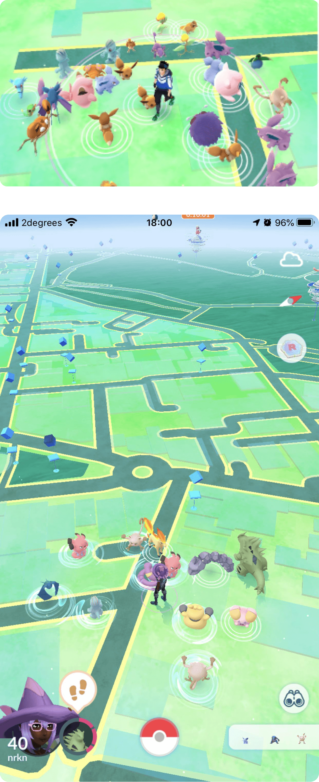
Interface aspect: Pokémon being too closely placed on the screen during encounters, particularly when multiple Pokémon spawn in the same location.
Players interact with Pokémon by tapping on them to initiate encounters. Tapping a specific Pokémon icon on the map initiates an encounter with that Pokémon.
The Heuristic of User control and freedom (Slip of finger) is being violated here because
of Accidental Taps: When the player wants to choose the Pokémon they want to catch, Players may accidentally tap on the wrong Pokémon during encounters. This can result in missed opportunities or frustration when attempting to catch a specific Pokémon. Thus, the user does not have control over their intended action
Increased Spacing: Implement a system that dynamically adjusts the spacing between Pokémon icons on the map to ensure they are not too closely placed. This can reduce accidental taps and visual clutter.
Improved Target Selection: Enhance the targeting system to make it easier for players to select the desired Pokémon when multiple are nearby. This may involve improving the tap hitbox or providing additional options for selection.
Filtering or Sorting: Allow players to filter or sort nearby Pokémon to prioritize encounters with specific species, making it easier to focus on catching Pokémon of interest in crowded areas.
User Customization: Provide users with the option to customize the spacing and size of Pokémon icons on the screen to better suit their preferences and gameplay style.
Tradeoffs:
Increased Spacing: Less Realism: Increased spacing might make the game world feel less realistic, as in the real world, objects can be closely packed.
Improved Target Selection: Complexity: Enhancing the targeting system could introduce additional complexity to the user interface, potentially confusing some players. Development Effort: Implementing precise targeting improvements may require significant development effort and testing.
Filtering or Sorting: Usability: Introducing filtering or sorting options may increase the complexity of the interface, potentially making it less intuitive for some users. Development Resources: Developing a robust filtering or sorting system may require significant resources and ongoing maintenance.
User Customization: Complexity: Allowing extensive customization could introduce complexity to the settings menu, potentially overwhelming users with too many options. Support and Testing: Ensuring that user customization options work seamlessly across various devices and screen sizes may require additional testing and support efforts.
Description of Violations
Recommendations
Screenshot
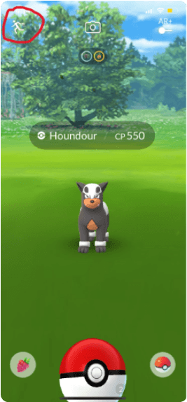
Interface aspect: Clicking the run icon directly leads you to the explore screen
The Heuristic of Error Prevention is being violated here because there is no confirmation message when the player is leaving an important screen, The user is unlikely to know that if they click on run the pokemon might disappear.
Players are left in the dark about how close their eggs are to hatching, which hinders their ability to make informed decisions and plan their gameplay effectively.
Visual Progress Bar: Implement a visual progress bar or indicator for each incubated egg in the player's inventory, showing the distance remaining until hatching.
Distance Counter: Display the actual distance walked for each incubated egg alongside the total distance required for hatching in the main gameplay screen.
Notification System: Send notifications or in-game alerts when an egg is close to hatching, providing players with timely updates.
Tradeoffs:
Visual Clutter vs. Information: Adding progress bars or distance counters may increase visual complexity, potentially overwhelming the interface.
Battery Usage vs. Real-Time Updates: Implementing real-time distance tracking for eggs could consume more device battery due to continuous location updates.
Notification Frequency vs. User Experience: Frequent notifications about egg hatching progress could become annoying and disrupt the user experience.
Learnings
Conducting a heuristic evaluation of Pokémon GO was a significant milestone in my journey as a designer. Through this process, I not only identified key usability issues but also gained insights that have made me a better designer. Here's what I learned, and how it has shaped my approach:
1. Empathy with Users: I realized the power of empathizing with users. Me being a Pokémon GO players, I could more deeply understand their frustrations and challenges. This empathy has become a cornerstone of my design philosophy.
2. Detail-Oriented Mindset: This heuristic evaluation has emphasized a meticulous eye for detail for me. Scrutinizing every element of the app allowed me to uncover issues that might escape casual observation. This meticulousness is now a part of my design DNA.
3. Putting Users First: User-centered design is non-negotiable. The evaluation reinforced the importance of designing with the user in mind. My recommendations were centered around improving the user experience, making it smoother and error-free.
4. Holistic Perspective: Evaluating Pokémon GO taught me the significance of taking a holistic view of design. It's not just about individual components; it's about how they come together to create a coherent experience. This understanding has broadened my approach to design.
5. Iterative Nature: Design is an iterative process. The evaluation is just the beginning; the true value lies in translating findings into actionable recommendations. This iterative approach aligns with my belief in the cyclical nature of design.
6. User Feedback: While I acted as a proxy user during the evaluation, I recognized the irreplaceable value of real user feedback. In the future seeking user input throughout the design process has become a priority.
7. Balancing Efficiency and Engagement: The delicate balance between efficiency and engagement became clear. Keeping users engaged without sacrificing efficiency is the key to a successful design. This lesson influences my approach to creating engaging yet functional experiences.
Thank you for your time reading this

Feel free to reach out for recommendation or suggestions
Because

Add me if you play Pokémon Go .
We can talk design and raid strategies
Shaanpradhan
YOUR TRAINER CODE:
3217 8348 5920
SHARE MY TRAINER CODE
COPY MY TRAINER CODE

Shaanpradhan
TRAINER NAME:
OK
